How Carole Baijings Explores Color Through Design
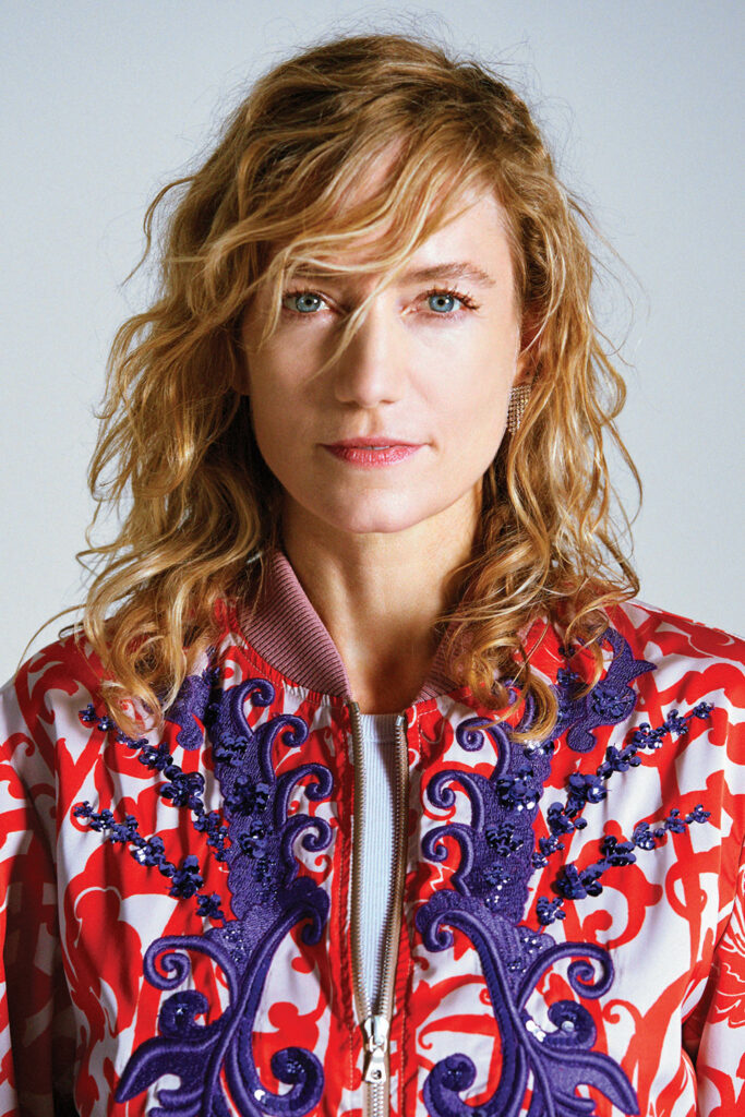
Just ask Proust, our earliest memories are often our most profoundly formative ones. Carole Baijings was born in Jakarta, Indonesia, and though the designer only lived there a year before her family returned to Amsterdam, where she’s resided ever since, the country’s colorful culture—“especially the vivid hues and patterns of the women’s clothes,” she notes—left an indelible impression. Not that life was much less visually stimulating in the Netherlands, famed for its cut-flower industry, where Baijings’s mother continued to wear bright clothing and her rug-dealer grandfather festooned his house with Persian carpets and Middle Eastern textiles.
Unlike many of her compatriots, Baijings’s career did not begin at Design Academy Eindhoven or a similar school. Rather she started as an assistant director for Rene Eller at Czar Films, one of Europe’s leading commercial production companies, where she worked on spots for Coca-Cola, Airbus, and other premium clients. “I would do the whole look and feel of the film,” she reports, “including the color concept.” But it was meeting and marrying an established designer, Stefan Scholten, that lead her into the profession proper. They began to collaborate, first on interiors before deciding they preferred creating products, launching Scholten & Baijings in 2000 with a well-received collection of rugs.
For nearly two decades the couple produced a range of objects, lighting, furniture, textiles, and conceptual works that combined minimalist forms and meticulously balanced color palettes with traditional craft techniques and industrial production methods. In 2020, the duo decided to explore the artistic challenge of working individually under their own names, though they continue to collaborate on some projects, such as a new portfolio of rugs for Maharam. We talked to Baijings recently about her current activities, which include being named creative director at Stylex, the New Jersey–based furniture manufacturer, for which she’s already shot a sophisticated advertising campaign and designed new showrooms in New York and at the Mart in Chicago, in time for the NeoCon trade show.
Carole Baijings On Her Conceptual Work
Interior Design: Tell us about your new relationship with Stylex.
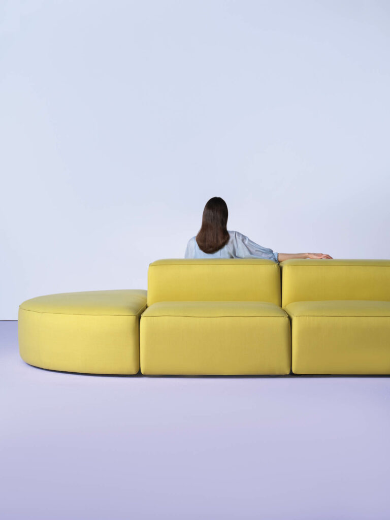
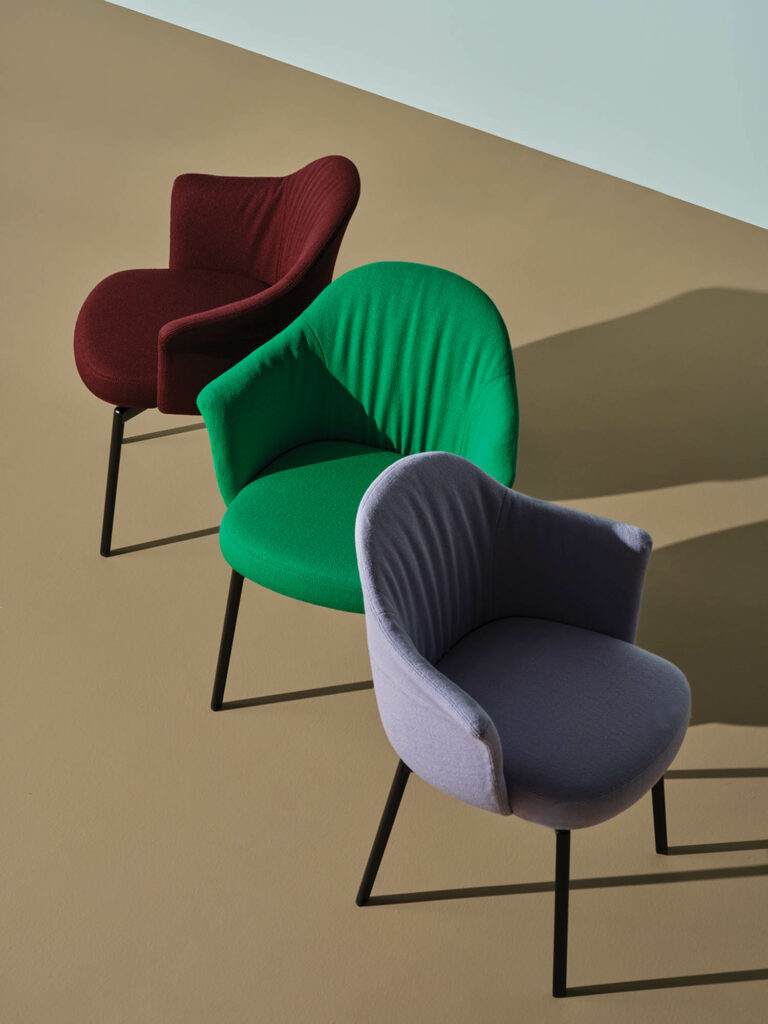
Carole Baijings: The company has its own art director for the furniture as produced in the factory, but I’m the creative director. Initially, I was asked to collaborate with design agency 2×4 on Stylex’s rebranding, to bring it to a new level. One of its specialties is the enormous number of powder-coat shades it offers clients—a big advantage—so we focused on the color story. I developed a new color wheel, since, for me, helping brands evolve includes suggesting what the future palette could be.
ID: You’ve also been refining the advertising and communications materials.
CB: For the product shoots, we saw the furniture as characters in the photos, so we didn’t really need props. But the combination of colors—not just those of the fabrics and finishes but also the wall and floor paints, which were mixed specifically for us—was super important, as were the lights and shadows. We created compositions that are a bit like art photography. Once the rebranding is complete, I’ll start designing pieces for them, as well as introduce other colleagues of mine to work with them.

ID: You often mention “the atelier way of working.” What does that mean in practice?
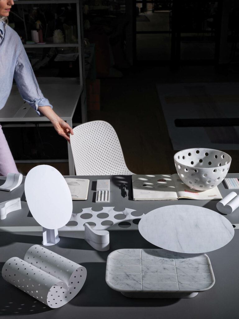
CB: It means for every project I mix my own colors; I make my own materials; I make my own models and maquettes. By doing so, I arrive at new forms—things that I couldn’t possibly develop on a computer, things that embody human skills. I think it’s a method that can be used on anything, no matter how specialized the craft or product, and it will always work. It takes more time, so may be more expensive, but it always helps us achieve a better outcome in the end.
ID: Did that apply to your new vases and bowls for the Italian marble company Luce di Carrara?
CB: Yes. As Scholten & Baijings, we’d already designed tables for Luce di Carrara, but this year the company asked me to make tableware—smaller pieces using scrap marble that would otherwise go to waste. All the objects came from making models. The form of the Muze vase, for example, comes from a plain sheet of paper folded to make one continuous piece; it’s a rounded, quite feminine shape. Working in the “atelier way” often gives us more outcomes than we can use for the launch of a collection, but my clients can use them later on. There’s an oval mirror on a stand like that; it will be introduced later this year.

ID: 2m2 Flowerfield, your project for the late Thomas Eyck, is almost 2 square meters of flowers. What was the origin of that?
CB: Nature has always been an inspiration for me, especially flowers. In the same way that clouds or waves cannot have a “wrong” shape, even the brightest flowers are never vulgar. Because I’m a colorist, I wanted to understand how this works, what’s the recipe. Really zoom in and you see that among a bloom’s mix of colors, say pink petals with yellow tips, there is always one hue that stands out, that’s a bit “off” and gives the composition an edge. So we began making blossoms by hand, mixing materials—paper, cardboard, textile, rubber, yarns—using layering and transparency to give them the unique feel of a flower. But it’s the color combinations that bring them into the future.





read more
DesignWire
10 Questions With… Sculptor Adam Birch
South African sculptor Adam Birch shapes curvy, functional forms from natural materials including trees, bones, and driftwood.
DesignWire
Celebrate 40 Years Of Hall Of Fame With 2024 Inductees
This year, Interior Design’s Hall of Fame turns 40, which makes for an extra celebratory evening. See who will be honored as 2024 inductees.
DesignWire
Designers Share How To Boost Chances Of Winning A Best of Year Award
What does it take to win an Interior Design Best of Year Award? Past winners and honorees spill their secrets about crafting top submissions.
